The relentless churn of the aviation industry never ceases to amuse, especially when you look at the paint jobs. Take Spirit Airlines, for instance. You might think their current screaming yellow aesthetic is a permanent fixture, like the 747’s iconic hump. But buckle up, buttercups, because the Spirit brand, much like a poorly maintained aircraft, has seen more makeovers than a Kardashian.
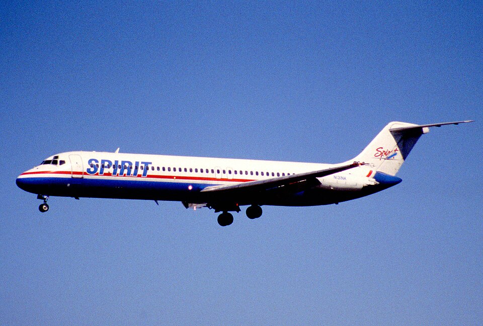
Let’s rewind the clock to May 1992, when the newly christened Spirit took to the skies. Their initial livery was, shall we say, understated. Picture a white DC-9, looking a bit like a blank canvas awaiting its first Ryanair-esque fee for a carry-on. The blue underbelly was a classy touch, mind you, much like the blue airline toilet paper, which, for all we know, they were already charging for.
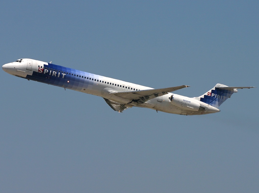
As the aughts dawned, so did a new logo. The white fuselages of the MD-80s suddenly sprouted a multi-hued brick design that, if you squinted, sort of resembled a bird in flight. This was the age of the great “rebranding” – a process where marketing execs decided to fix what wasn’t broken, usually at the expense of passenger comfort (and legroom). It was at this moment that Spirit decided to drop the word “Airlines” from the logo – presumably to save on paint costs.
Then, the Airbus A320s came along, looking all sleek and…silver. The pixelated logo was still present, but now it looked like something you’d find on a low-budget video game – perfect for the on-board entertainment offerings, if you brought your own tablet.
“It was a bold move,” says Igor “Altitude” Angleman, a noted aviation historian and self-proclaimed expert in aerodynamic marketing. “They essentially said, ‘We may not have comfortable seats, but at least our planes look, uh… vaguely modern.’ A masterstroke of perception management.”
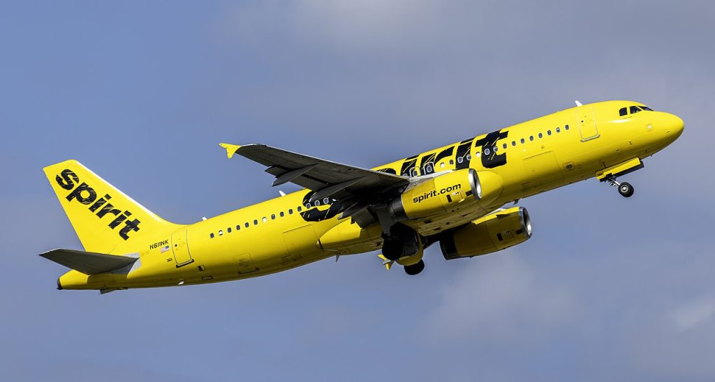
Of course, the pièce de résistance arrived in 2014: the canary-yellow era. Gone were the subtle blues and silvers; hello, eye-searing sunshine. As RBB Communications noted in their “Bare Fare” campaign write up, this was less about offering a better product and more about embracing the bare necessities, which, in Spirit’s case, meant charging for everything that moved, breathed, or took up space.
“It’s a testament to the spirit of… well, Spirit,” offers Burt “Turbulence” Trowbridge, a former head of cabin service now employed at a company that makes airline trash cans. “They’ve taken cost-cutting to an art form, and the yellow livery is just the icing on the no-frills cake.”
The latest chapter, the “More Fly” initiative, hints at… more. It’s all about those “Go” fares: Go Big, Go Comfy, Go Savvy, Go. I suspect in a few more years, Spirit will have an option for “Go… without a seatbelt.” But hey, at least they’re consistent.
In a nutshell, Spirit’s brand evolution proves one thing: In the cutthroat world of ultra-low-cost carriers, it’s not enough to be cheap. You have to look cheap – and embrace it.